Ask Your Favorite AI
Copy this article in AI-ready Markdown for ChatGPT, Claude, Gemini, and more.
Online shopping habits have changed dramatically over the last few years. People are no longer browsing stores only from desktops or laptops. Today, a huge percentage of ecommerce traffic comes directly from mobile devices. Customers shop while commuting, relaxing on the couch, standing in a queue, or scrolling during lunch breaks.
And that changes everything about how your store needs to function.
Because on mobile, convenience matters even more. If shoppers can not quickly find what they are looking for, they would not spend time figuring things out. They’ll leave.
That’s why mobile-friendly filters are no longer just a “nice feature” for ecommerce websites. They have become essential for creating a shopping experience that actually converts.
Mobile Shoppers Browse Differently
Desktop users usually have space to explore. They can see menus, categories, filters, and product grids all at once. But, mobile users don’t! Mobile users are working with smaller screens, limited space, and shorter attention spans. Endless scrolling becomes frustrating very quickly, especially when stores have large product catalogs.
Imagine trying to browse hundreds of products on a phone without filters. It feels overwhelming almost immediately. That’s exactly why filtering matters so much on mobile.
Good filters help shoppers narrow things down quickly without making them dig through pages of products they do not care about.
Why Poor Mobile Filtering Hurts Sales?
A lot of WooCommerce stores technically have filters, but they are clearly designed for desktop users. You have probably seen this before:
- Tiny filter buttons that are hard to tap
- Filters that disappear on mobile
- Sidebars that break layouts
- Dropdowns that feel cluttered
- Slow page reloads after every selection
These small usability issues create friction. And in ecommerce, friction kills conversions. Because when customers struggle to browse products, they usually do one of two things:
- Leave the site entirely
- Or, settle for not buying anything at all
Neither outcome is good for your business.
Mobile-Friendly Filters Improve Product Discovery
The easier it is to narrow down products, the faster customers move toward checkout. Mobile-friendly filters help shoppers:
- Find products faster
- Reduce unnecessary scrolling
- Compare options easily
- Browse large catalogs comfortably
- Shop with less frustration
And, this becomes even more important for stores with:
- Multiple product categories
- Variations like size or color
- Large inventories
- Seasonal collections
- Technical or attribute-based products
Without proper filters, mobile shopping starts feeling chaotic.
What Makes a Filter Mobile-Friendly?
A mobile-friendly filter is not just a smaller version of a desktop sidebar. It is designed specifically for touch interaction and smaller screens. Good mobile filters should:
- Be easy to tap
- Open smoothly without breaking the layout
- Load results quickly
- Stay clean and uncluttered
- Work properly across all devices
Most importantly, they should help customers refine results without interrupting the shopping experience. That is where many default WooCommerce filtering systems fall short.
The Problem with Default WooCommerce Filters
WooCommerce provides the basic filtering functionality. But, for growing stores, that usually is not enough! The default filters often:
- Feel outdated on mobile
- Lack flexibility
- Offer limited styling and layout control
- Don’t handle advanced filtering well
- Create clunky navigation experiences
And when mobile traffic becomes the majority of your visitors, those limitations become hard to ignore.
How SearchFilterSort Improves Mobile Shopping?
This is where SearchFilterSort for WordPress and WooCommerce makes a noticeable difference. Instead of forcing desktop-style filters onto smaller screens, it gives store owners more control over how filtering behaves on mobile devices.
With the SearchFilterSort plugin, you can create:
- Responsive mobile-friendly filters
- AJAX-powered filtering without page reloads
- Clean sorting and filtering layouts
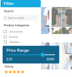
- Product filters based on categories, price, attributes, ratings, tags, and custom fields
The result feels faster, cleaner, and far more user-friendly.
Why AJAX Filtering Matters on Mobile?
One of the biggest frustrations of mobile shopping is waiting for pages to reload repeatedly. Every reload interrupts browsing.
AJAX-powered filtering solves this by updating products instantly when filters are selected. That means shoppers can:
- Filter products smoothly
- Explore options faster
- Stay engaged longer
It creates a shopping experience that feels modern instead of outdated. And that difference matters more than most store owners realize.
Mobile UX Directly Impacts Conversions
There is a direct connection between usability and sales. When customers can find what they want in seconds, the following things happen:
- Bounce rates decrease
- Product engagement increases
- Checkout completion improves
- Average session time grows
Mobile-friendly filters do not just improve navigation, they improve the entire buying journey. And when combined with smart sorting options, customers feel more in control while shopping. That confidence often leads to higher conversions.
Best Practices for Mobile-Friendly Filtering
If you want your filters to actually help customers, keep these principles in mind:
- Keep Filters Simple: Don’t overwhelm users with too many options at once.
- Prioritize Popular Filters: Price, category, size, and ratings usually matter most.
- Make Touch Interaction Easy: Buttons and dropdowns should feel comfortable on smaller screens.
- Use Instant AJAX Updates: Avoid full-page reloads whenever possible.
- Test Across Devices: A filter that works on one phone might feel awkward on another.
Why Does This Matter More Than Ever?
Mobile ecommerce is no longer growing, it’s already dominant!
Customers expect shopping experiences that feel fast, intuitive, and effortless. If your store feels difficult to browse on mobile, shoppers notice immediately. And unfortunately, they rarely stick around long enough to give you a second chance. That is why investing in mobile-friendly filters is not just about design anymore. It’s about usability, retention, and revenue.
Final Thoughts
A good ecommerce experience is not only about having great products. It’s about helping customers find those products easily.
And on mobile devices, filtering plays a huge role in that experience. With tools like SearchFilterSort for WooCommerce, you can create filtering systems that feel natural on smaller screens, improve product discovery, and make shopping significantly smoother. Because when customers can browse comfortably, they’re much more likely to buy.
FAQs
Do mobile-friendly filters really affect sales?
Yes, easier navigation reduces frustration and helps customers find products faster, which improves conversions.
Why are default WooCommerce filters not enough?
What is AJAX filtering?
Can SearchFilterSort work with large WooCommerce stores?
Do I need coding knowledge to set up mobile filters?
Can I filter by custom product attributes?
Powered by WPFAQBlock.com
Last updated on September 22nd, 2026